Illustrated packaging & logo design for hiking food brand Gwindle
Project overview
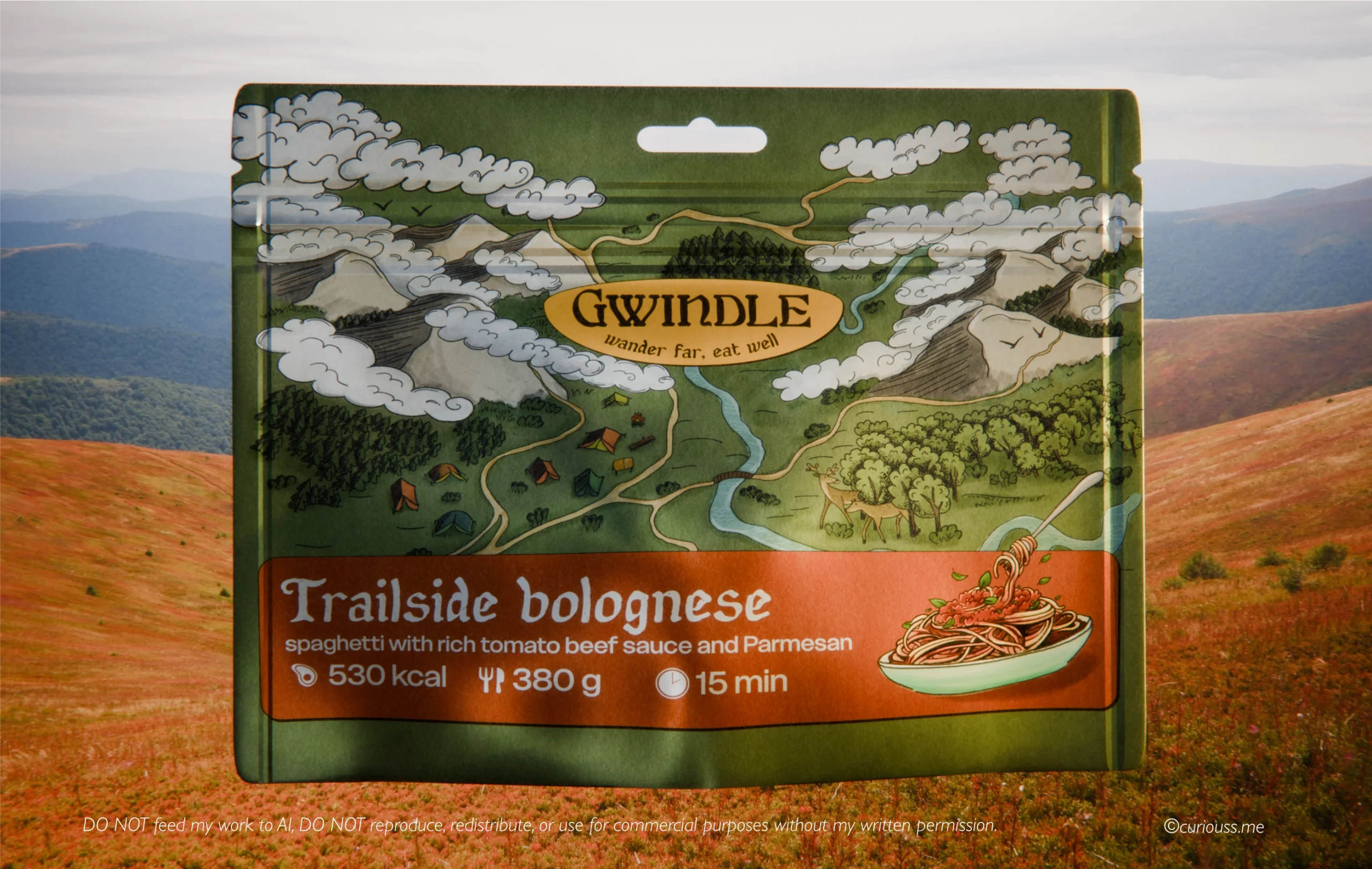
Gwindle is a brand that makes hiking and camping meals feel like home.
Inspired by fantasy world maps, hiking trails, mountain rivers, campsites, and vintage aesthetics. Gwindle started with a vision that spending time outdoors and seeing remote locations should always come in hand with eating well on the trails.
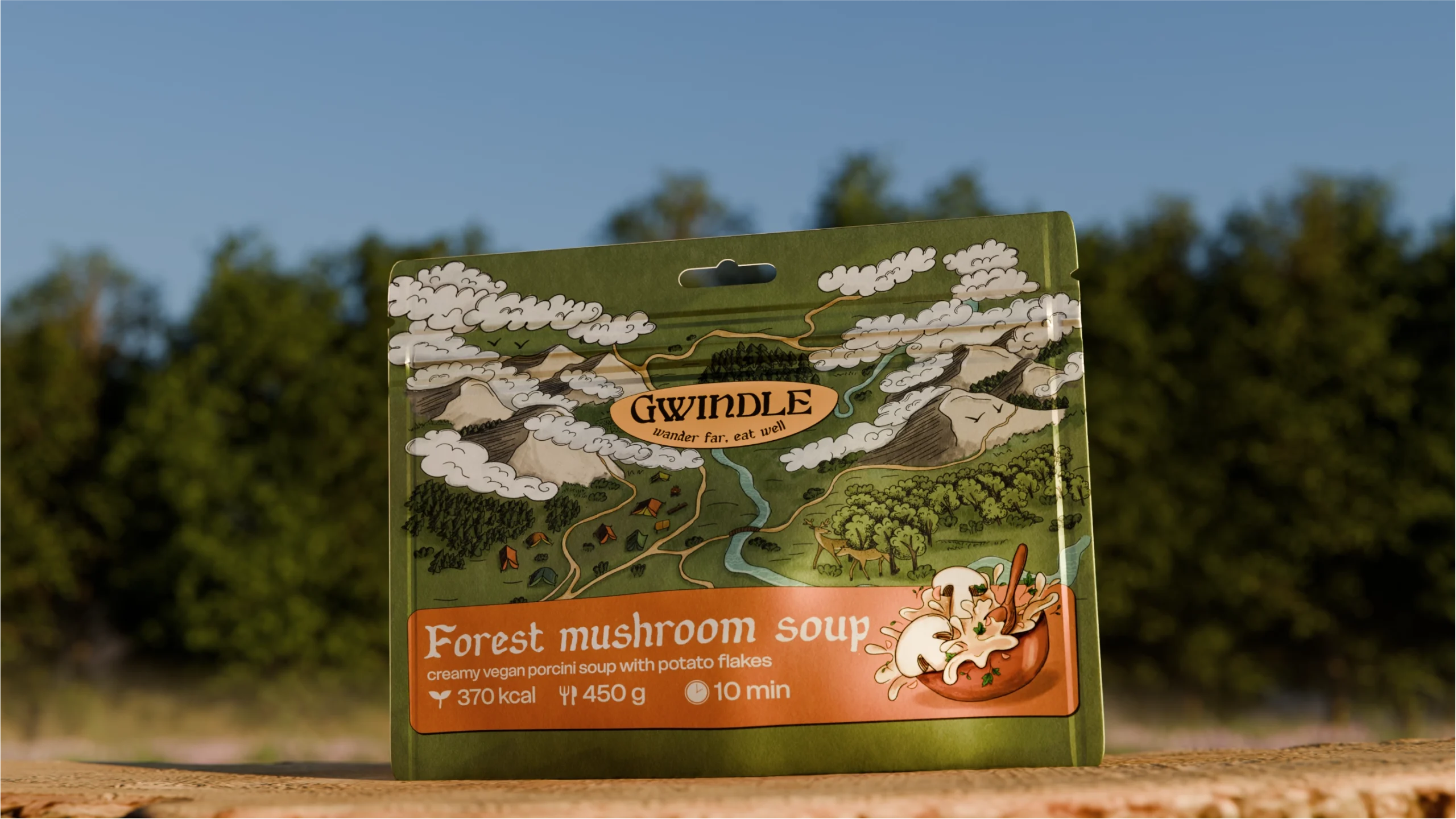
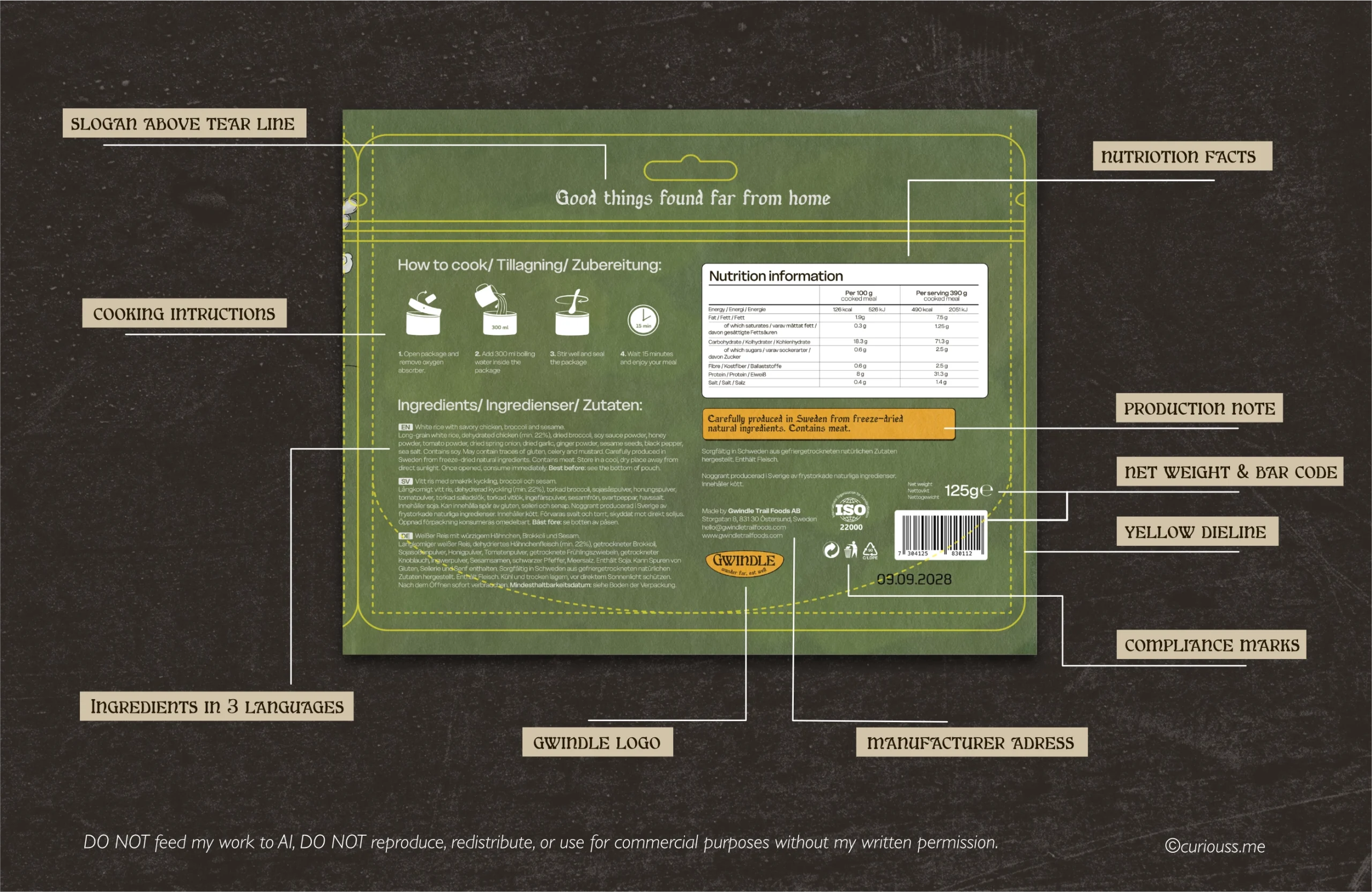
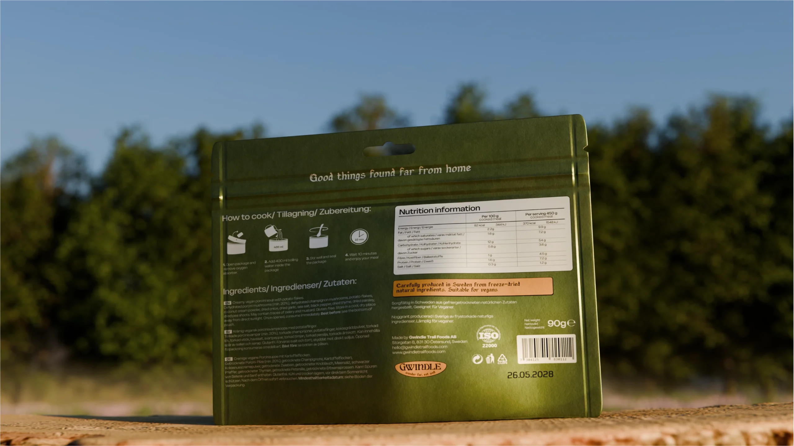
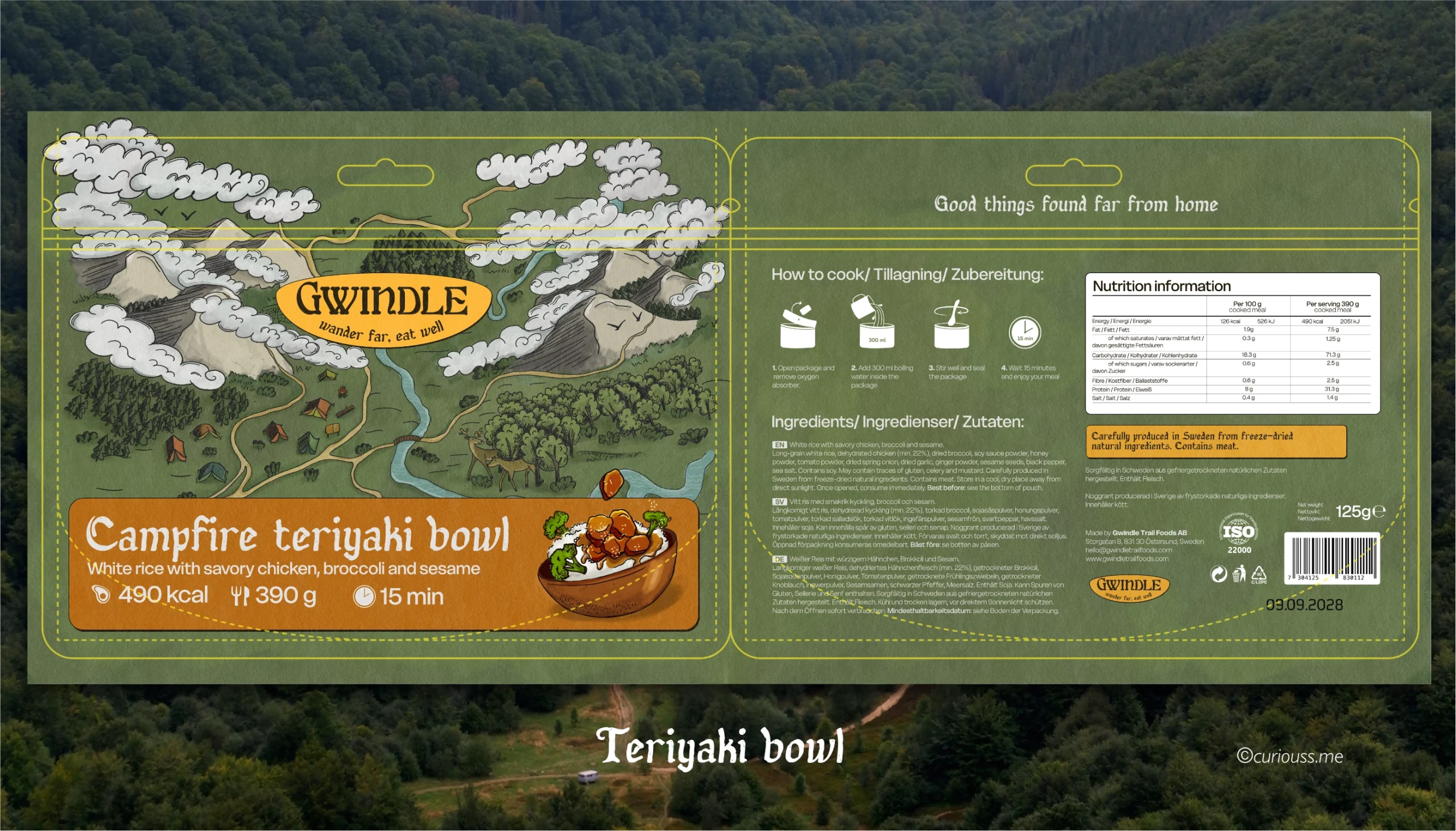
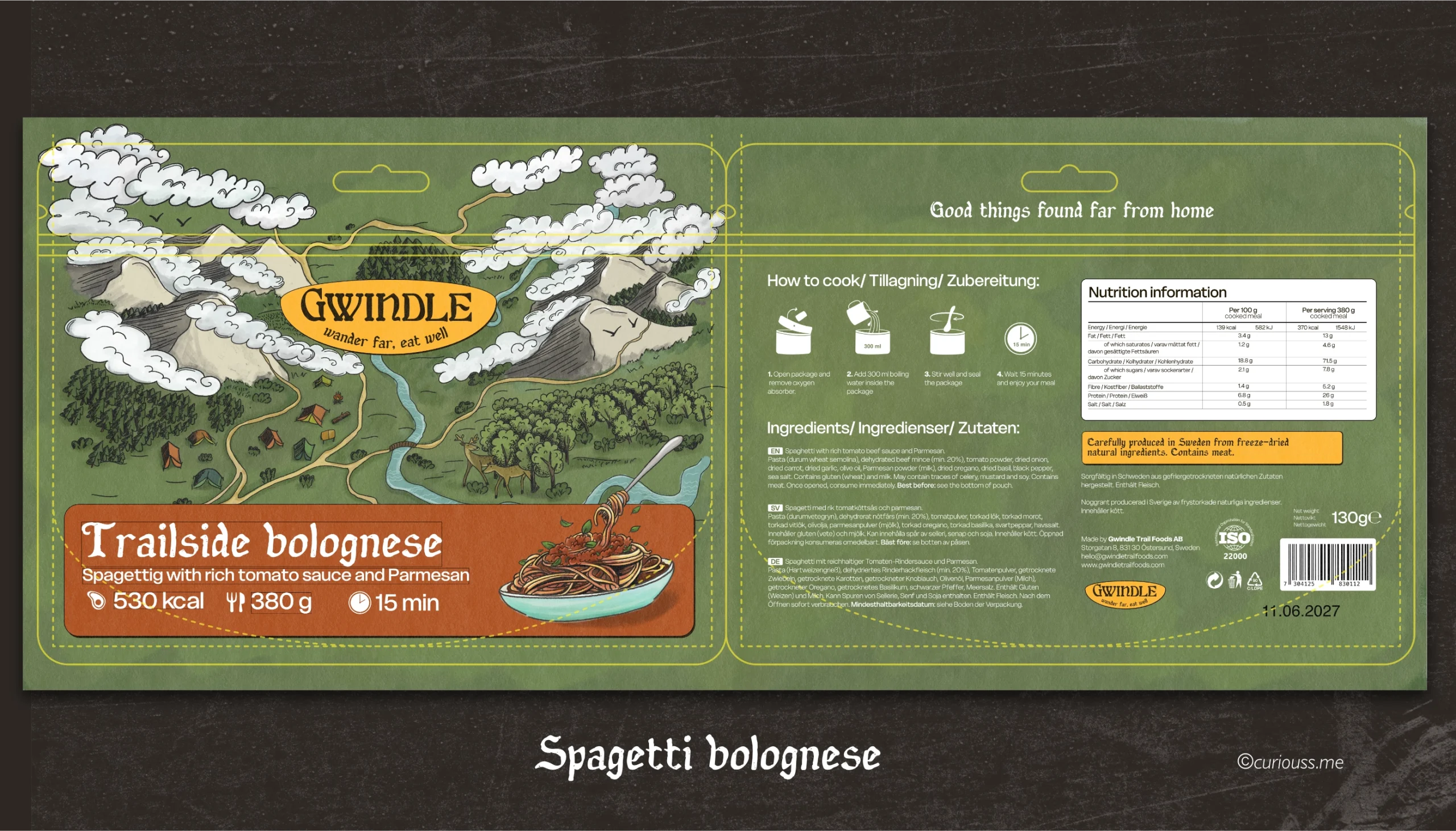
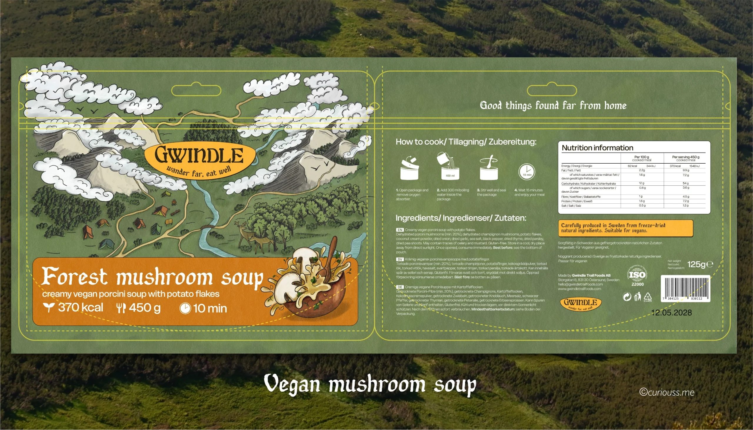
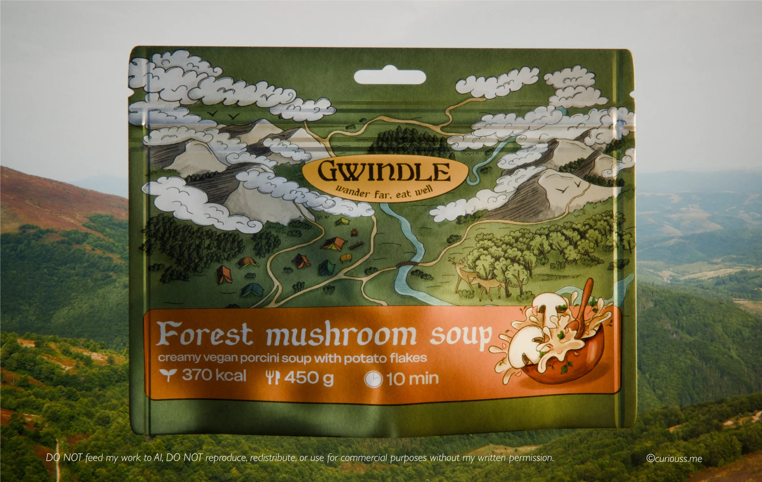
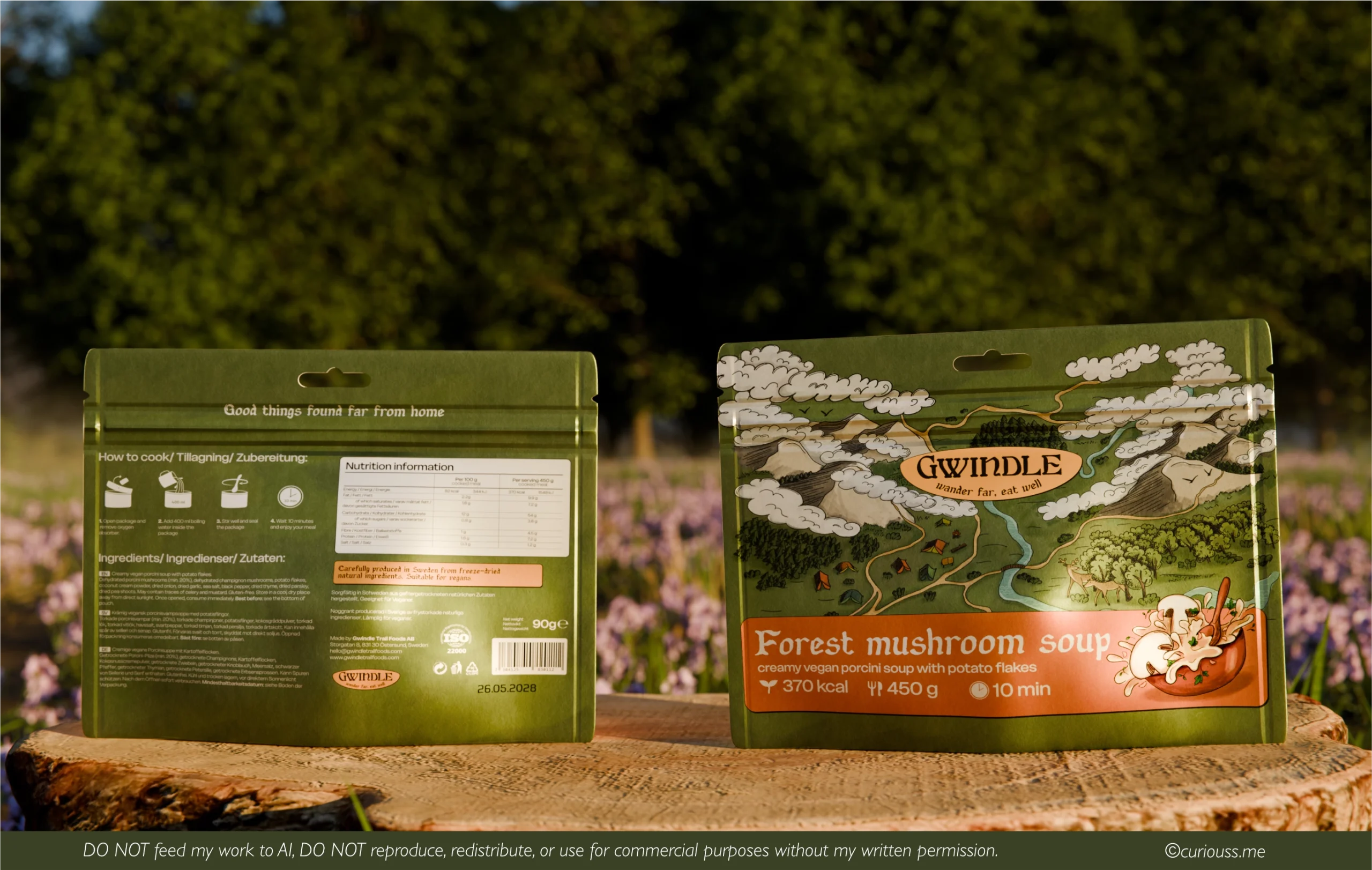
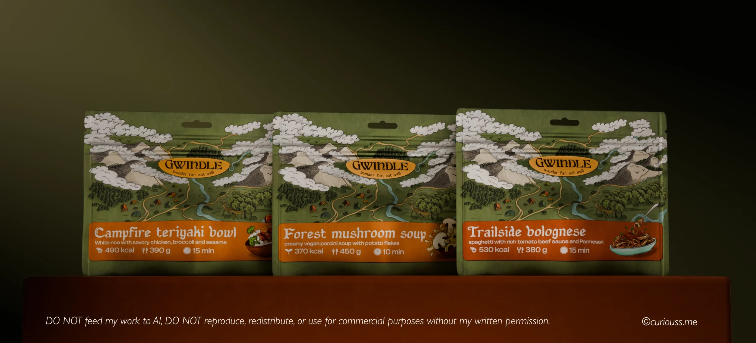
The scope of the project included 3 ready-to-print pouch packaging designs that consisted of an original hand-drawn main illustration, logo design, 3 product labels with micro illustrations and back panel design with cooking intrstructions, ingreadients in 3 languages and nutrition facts.
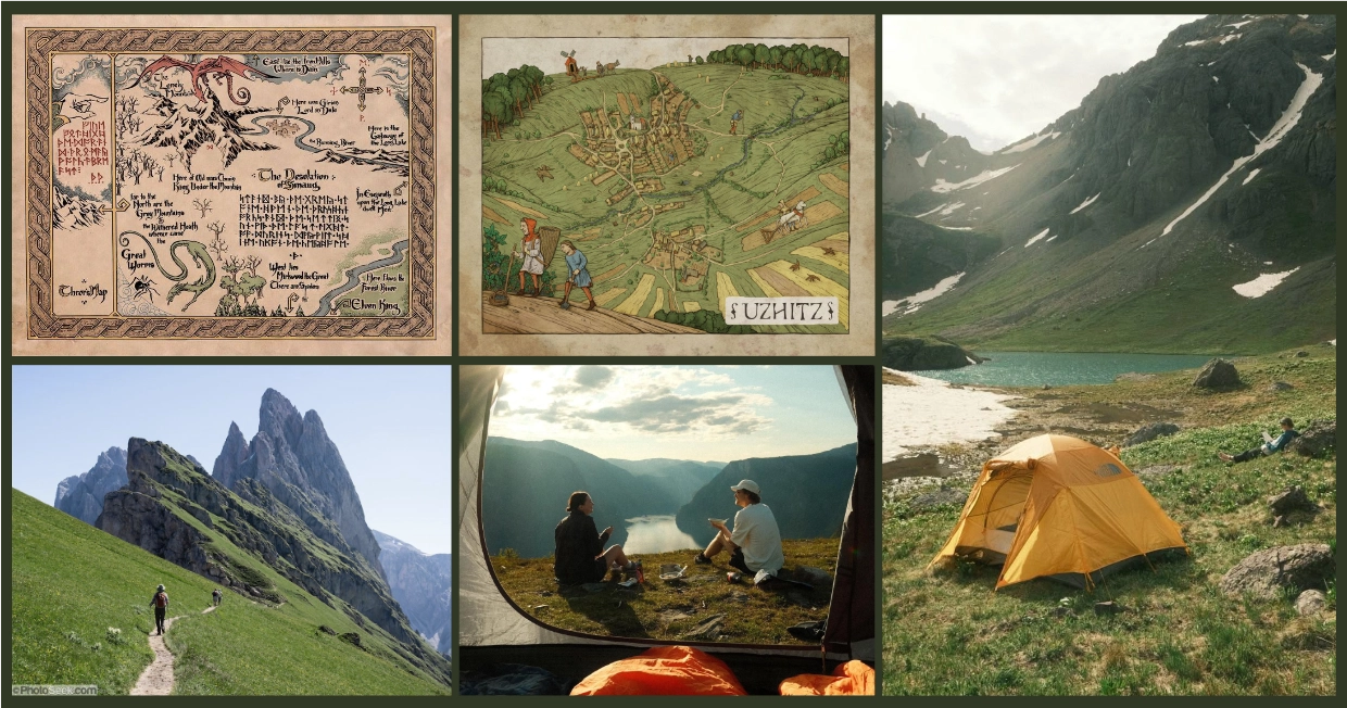
moodboard
Step 1. Map illustration
Exploring different map layouts on paper, then transitioning them into a digital format. The main goal was to make a busy and slightly whimsical map of a fictional mountain location that would be used across all Gwindle products.
The illustration had to be slightly whimsical and convey the feeling of excitement that you get when you leave a busy city life, office job, or another daily routine and go to beautiful far away locations. Where there is no phone signal, no Internet, no ChatGPT or social media.
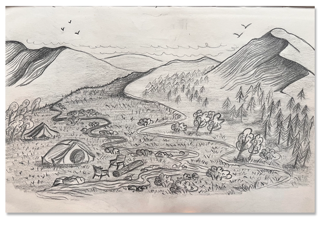
first scketch
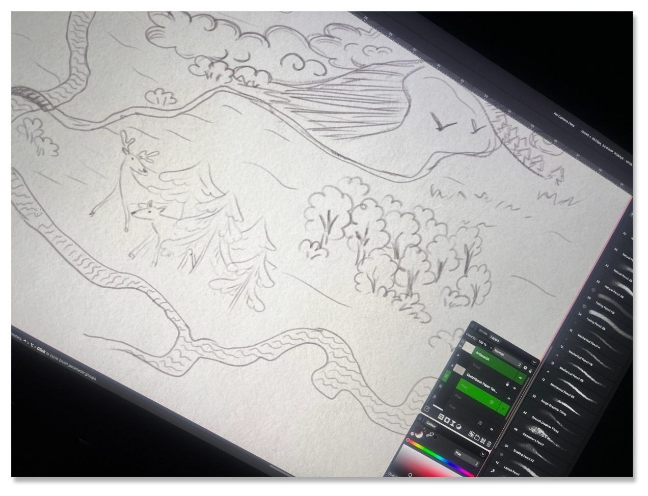
Turning a sketch into a finished digital illustration to use in the future design. Absolutely zero AI used in the process.
The final digital sketch evolved into a slightly different map, as I added more whimsical details, like curly clouds and a friendly deer hiding behind the pine trees.
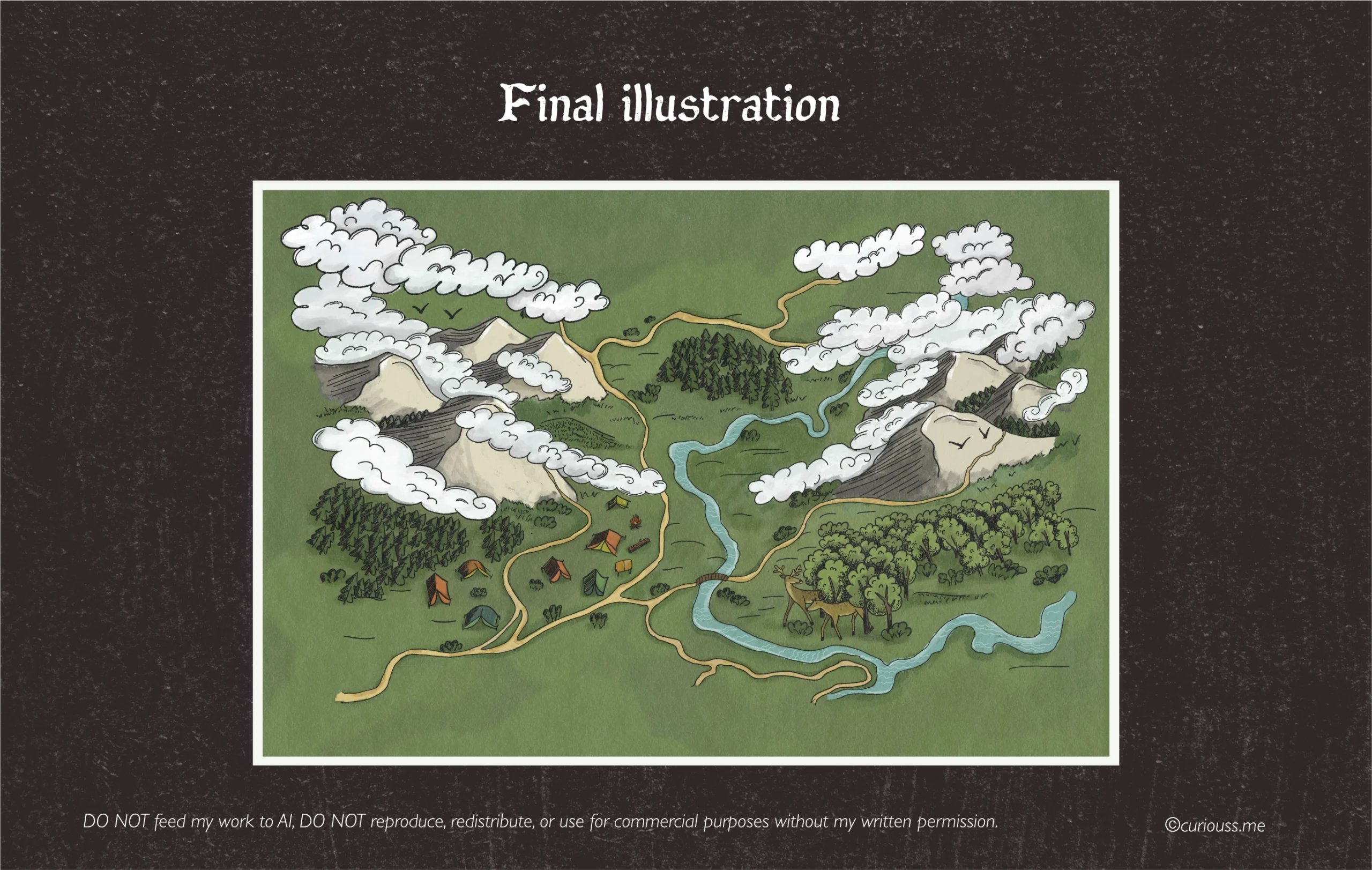
Step 2. Logo design
The logo wasn't the first thing I designed for Gwindle. And there was a reason for it. I intentionally started with the main illustration, as without knowing the exact colors, brush styles, map layout and overall vibe - I couldn't design a logo that would fit naturally.
Gwindle's whole identity goes beyond the name. It's about healthy, balanced meals that taste like home-made food, but you mostly eat them when you are far away from home.
Font exploration
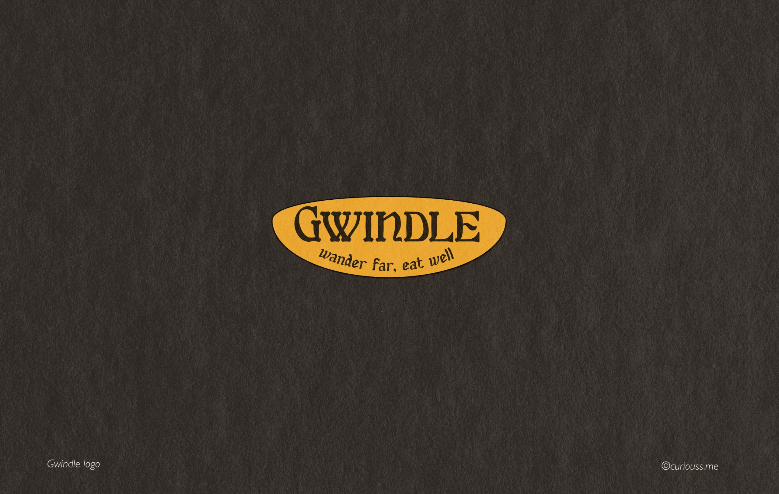
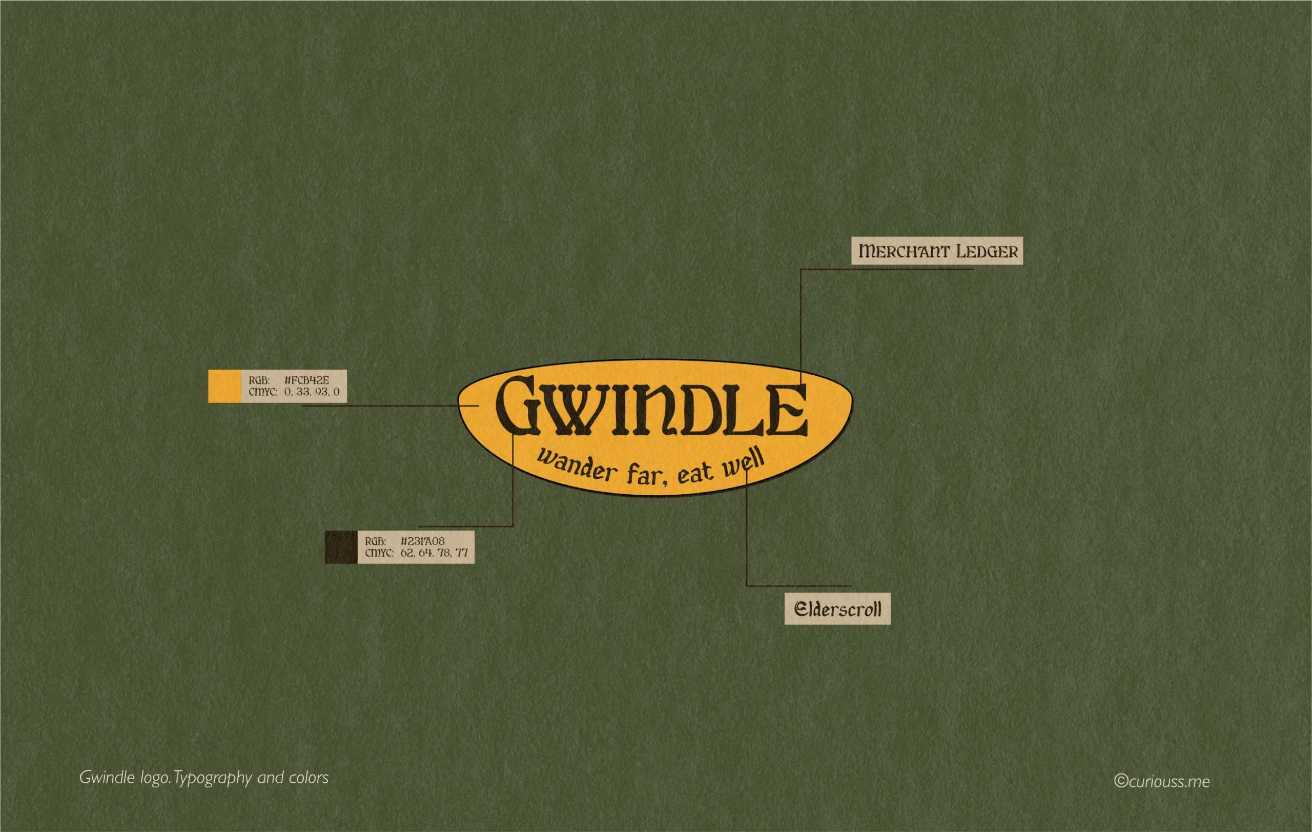
The idea for the logo came from signage that you could see on a medieval tavern, hanging outside the door. Imagine a colorful wooden sign with a wordmark and tagline, engraved on top. For that, I needed to find a matching font combination that would amplify the main illustration and convey the vibe of outdoor adventures in a company of friends. Since the whole concept wasn't very common among freeze-dried meals products, the idea of a toned down hand-drawn packaging with a crafty medieval fantasy inspired logo felt like something that would stand out on a shelf.
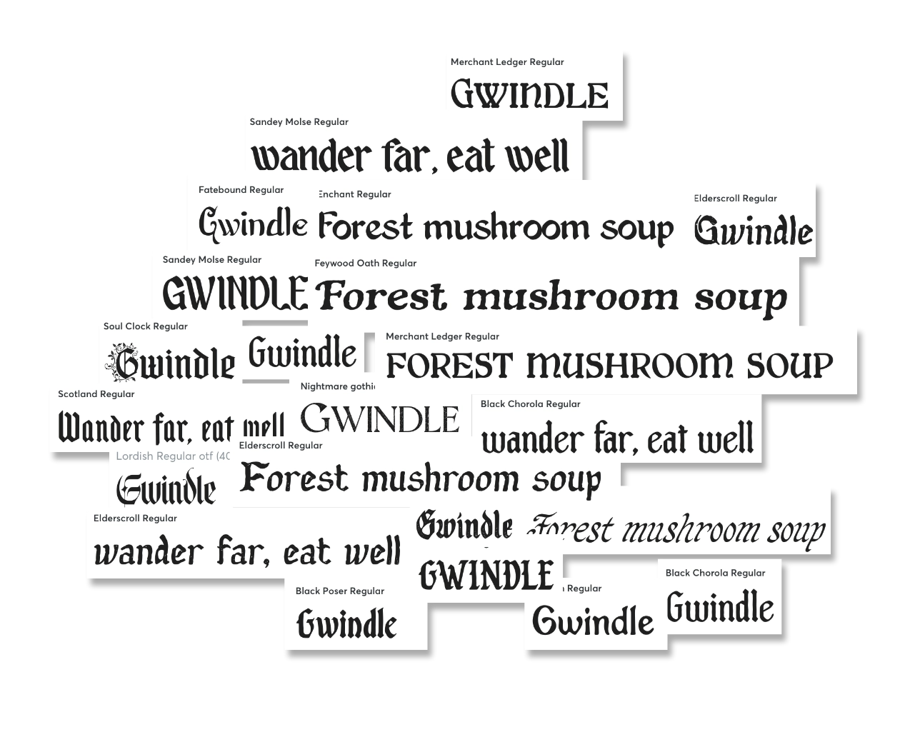
font research process
Micro illustrations and labels
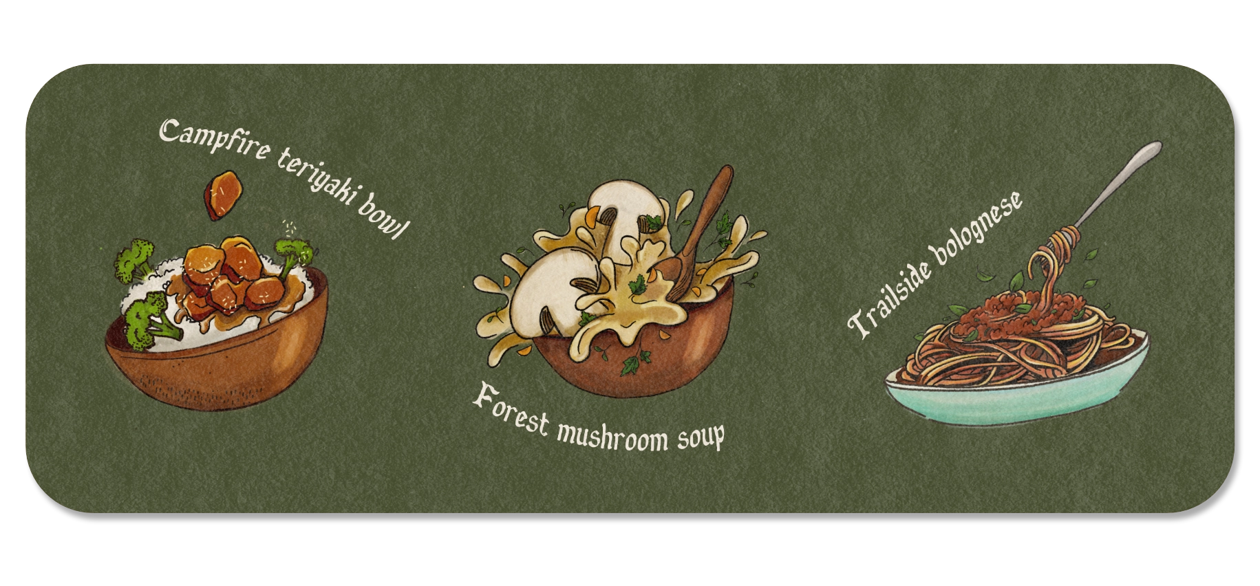
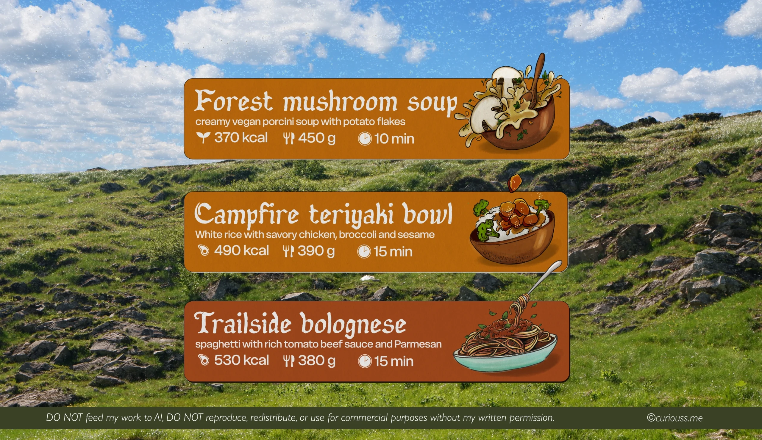
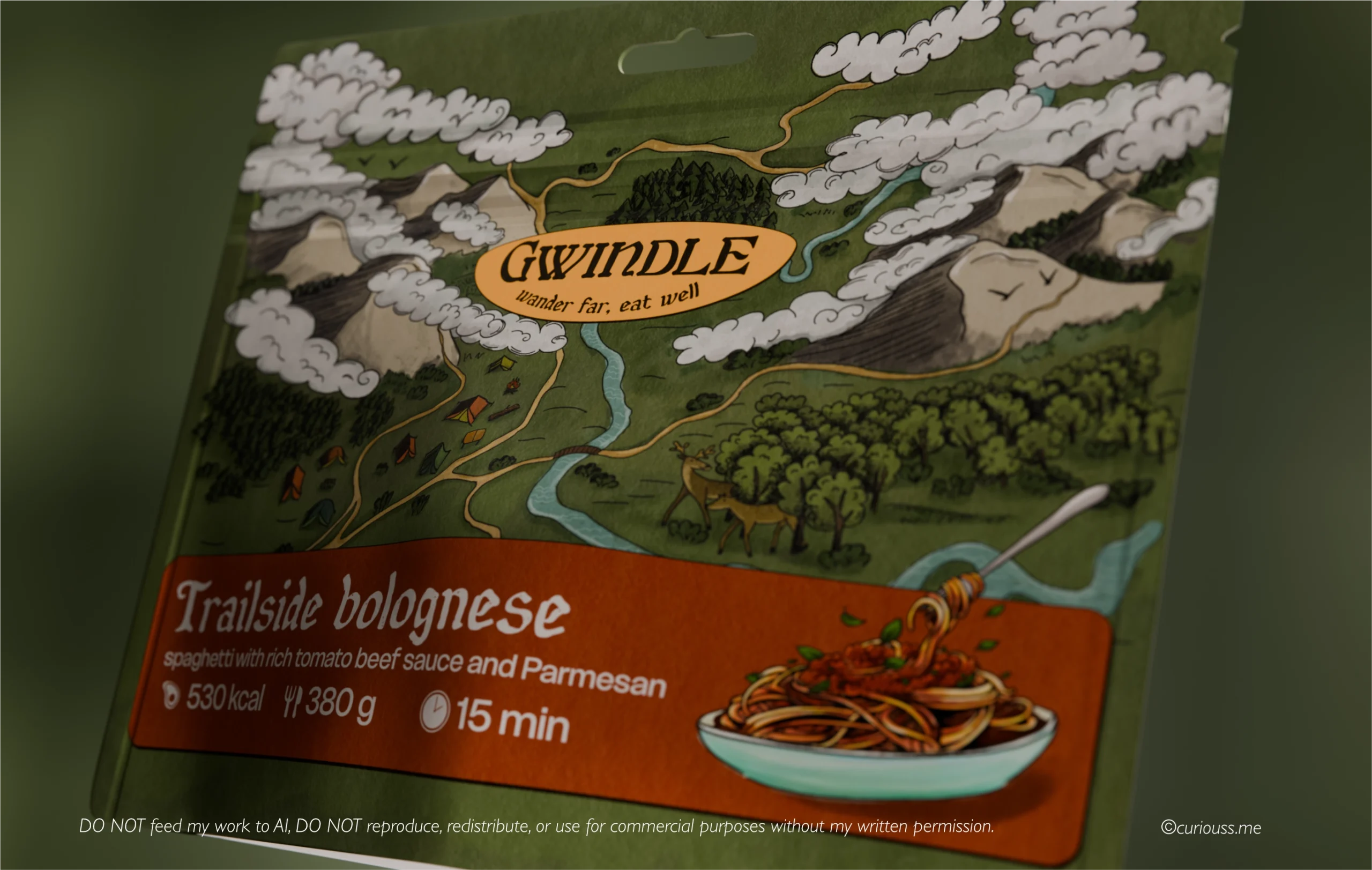
After finishing the main illustration and logo design, the illustrative direction started coming to shape, but packaging still lacked real product images - to help differentiate between them. The scope of the project included designing unique packaging for a mushroom soup, spagetti bolognese and teriyaki rice with chicken, with a possibility to extend the product line and apply the established direction to future products.
I needed to find a way to organically fit the product image into the label, so that the customer knew what was inside the package. The concept of Gwindle packging is to be 100% hand-drawn, which is why, the meal illustrations needed to be hand-drawn too.
Step 3. Back panel design
why you should work with me
Here is what my clients said after working with me.

⭐️⭐️⭐️⭐️⭐
"Anastasiia did a great job designing our barefoot shoe shop's storefront window design. She was always available, open to all modifications and in general it was easy to work with Anastasiia. Thank you!"
Brita

⭐️⭐️⭐️⭐️⭐
"Anastasia was incredible. She led the project while taking into consideration our business and how we needed to evolve. She conceived a design, happily made edits based on feedback, and put an awful lot of time into ensuring everything was perfect."
Jamie

⭐️⭐️⭐️⭐️⭐
"Anastasiia is wonderful to work with and I am re-hiring her for another project ASAP!
She is timely, professional, and exactly what we needed! Highly recommend!!"
Rai